Working With Bold Wall Colors
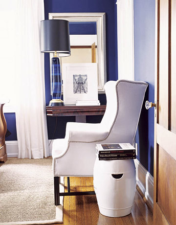
 Ben Moore Marine Blue
Do you ever wonder how a designer transforms the walls in the room into the star of the room? How do they design the room around a bold wall color and make it look so gorgeous?
 flickr Ben Moore Starry Night Blue
Look at the furnishings in the photos above and below:


The common thread is that when you are using a dark, bold wall color, all the other furnishings in the room must be a basic neutral and ‘blend’ together with the wall color so that it does not take attention away from the walls.

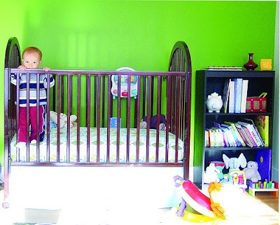
Notice that when using a bold wall color, the sofa, the bed, the rug and even the accessories are neutral so that it does not take the focus off of the wall.


The neutrals that seem to work best to are white, tan, black and brown.

So remember: If you want to use a dramatic, dark wall color, and make it the star of the room, it is best to use neutrals for your fabrics, furniture, rug and artwork.Now, do you think you can add another color in the mix for a ‘pop’ in the room when using a bold wall color:?

Love the bunny print! Love the yellow bench!

I think it works, but in very small doses. For example, in the photo above, if you start to sprinkle more of the raspberry color like the flowers around in the room, you start taking the focus off of the walls and instead making the accessories the star of the room.

So now do you feel more confident in using a darker wall color now that you know this little designer secret? Hope this post helps you to understand another color concept.I want to thank all of my readers for writing to me and telling me that you have learned so much about color and decorating from reading my blog. Really makes it all worth while for me. Thank you. xoIf you need helping choosing paint colors for your home, contact me today!All photos taken from google.com unless otherwise noted.